The 1980s mid-1980s
Pastel and Pattern-Clash Prints
Soft pinks, mints, and lavenders printed in deliberately mismatched geometric patterns and layered together on purpose - a Memphis-design-influenced palette that made clashing itself the point.
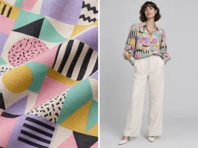
This decade's pastel-and-clash print story borrows its visual logic directly from the Memphis Group, the Milan-based design collective whose bold, deliberately mismatched geometric patterns and soft-yet-jarring color combinations - pink with mint, lavender with mustard yellow - reshaped furniture and product design starting in 1981 before fashion textile printers picked up the same instinct. Applied to fabric, that meant abstract geometric shapes - squiggles, triangles, confetti-like scatter patterns - printed in colors soft enough to read as pastel but combined in ways that actively refused to coordinate the way a "tasteful" print pairing traditionally would.
The deliberate clash is really the whole point, and it's worth being precise about that: this isn't a case of prints being paired badly by accident, it's a genuine design philosophy that treated visual tension and mismatch as more interesting than harmony. A blouse in a clashing geometric pastel print, worn under a solid-color blazer or paired with an equally busy separate, reads as confidently of-its-moment specifically because it isn't trying to resolve into a calm, unified outfit the way earlier decades' print pairing generally aimed to.
I think this print story is a useful reminder that this decade's visual maximalism wasn't confined to its loudest, most obvious excesses like sequins or full taffeta skirts - it shows up just as clearly in a quieter, softer color palette that still refuses restraint, just through pattern clash and color combination rather than sheer volume or shine. The same underlying appetite for "more" runs through both registers, even though they look, on the surface, like they belong to different design sensibilities entirely.